Coloring Books for Low Vision: Large-Print Designs That Are Easy on the Eyes
By K. Terry, author of fourteen bold & easy coloring books · Updated July 26, 2026
Coloring books designed for low vision feature large-print layouts and thick, high-contrast outlines, allowing individuals with vision impairments to enjoy the relaxing benefits of art therapy without eye strain.
Featured in this article
Art and creativity should be accessible to everyone. However, as we age or experience changes in our vision, hobbies that once brought joy—like reading, sewing, or coloring—can become frustrating. For adults dealing with presbyopia, cataracts, or macular degeneration, the standard adult coloring book is often impossible to use.
The Problem with Intricate Coloring Books
During the adult coloring boom, publishers competed to create the most highly detailed designs possible. Pages were filled with hundreds of tiny, hair-thin lines. For someone with 20/20 vision, these require intense focus. For someone with low vision, these pages look like a blurry, stressful gray mess.
Attempting to color these books can lead to severe eye strain, headaches, and the feeling that a beloved hobby is no longer accessible.
The Importance of High Contrast and Large Print
To make a coloring book accessible for low vision, the design must rely on high contrast and simple geometry. This is exactly what the “bold and easy” format provides.
- Thick Black Outlines: A heavy line weight creates a stark, visible boundary between the white paper and the line itself. This makes it much easier to track the edges of the shape you are coloring.
- Large, Open Spaces: By removing unnecessary interior details (like the tiny veins on a leaf or the intricate scales on a fish), the colorist is left with large, manageable blocks of space.
Choosing the Right Books
At The Paper Riot Store, all of our books are designed with this accessibility in mind. For individuals with low vision, we highly recommend books with distinct, recognizable subjects:
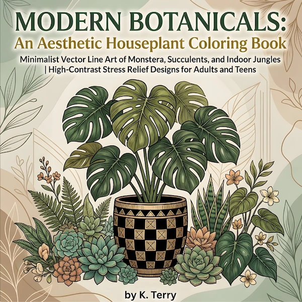
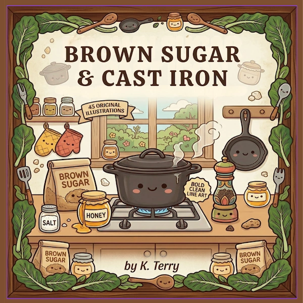
Modern Botanicals offers sweeping, large-scale leaves that are very easy to navigate. Similarly, Brown Sugar & Cast Iron uses strong, simple shapes to depict cozy kitchen scenes, allowing the colorist to rely on recognizable, everyday objects.
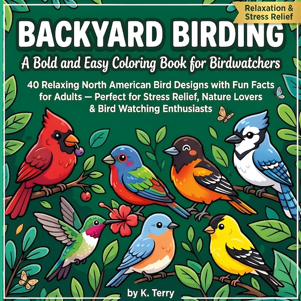
If the colorist enjoys nature, Backyard Birding not only features large-print birds but also prints the accompanying fun facts in a large, readable font.
Tips for Coloring with Low Vision
1. Good Lighting is Essential: Always color in a well-lit area. A dedicated task lamp directed at the page can drastically improve contrast and visibility.
2. Use High-Contrast Tools: While colored pencils are soft, markers (whether water-based or alcohol-based) lay down vibrant, opaque ink. This creates a higher contrast against the white page, making it easier to see the progress you are making.
3. Take Breaks: Even with large print, focusing for long periods can cause fatigue. Color a single large element, take a visual break, and return when you feel rested.
Conclusion
Vision changes shouldn’t mean the end of creative hobbies. Large-print, bold and easy coloring books are specifically designed to bridge this gap, offering a relaxing, accessible, and dignified artistic outlet for everyone.
Frequently Asked Questions
Are large-print coloring books helpful for macular degeneration?
Many individuals with mild to moderate low vision conditions, including macular degeneration, find that thick, high-contrast black lines and large spaces make coloring accessible again.
What designs are easiest to see?
Designs with distinct, solid outer boundaries and minimal interior detailing are the easiest to see. 'Bold and easy' style books are specifically engineered this way.
Can I use colored pencils or should I use markers?
Markers often provide a higher contrast against the white page, making it easier to see what you have colored, which is very helpful for those with low vision.
Accessible & Beautiful
Our bold and easy coloring books are designed to be enjoyed without the eye strain.
Browse the Collection